Spider-Noir Font – Know the Name
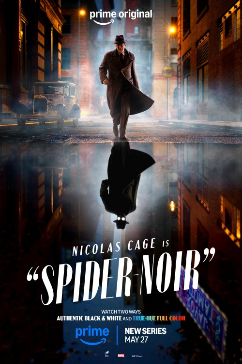
The Spider-Noir series poster presents the main title “Spider-Noir” as the central typographic anchor. The design relies on a tall, condensed display typeface. Every character uses capital letterforms rendered in flat, opaque white. A smaller introductory credit uses a simpler, lighter sans-serif style to complement the primary treatment.
The text cluster sits across the lower third of the vertical frame. It spans nearly the full width of the street reflection below the central figure. The main title scales significantly larger than the secondary actor credit above it. This substantial scale allows the letterforms to balance the visual mass of the human subject above.
Deep shadows in the watery ground provide ample negative space around the letters. This dark buffer prevents the typography from clashing with background street elements. The stark contrast between the bright white fill and the dim surroundings establishes an immediate visual anchor. The eye moves directly from the glowing mask eyes downward to read the series name.
Identified Font(s)
Portia

| match_case Font Name | Portia |
| person Designer | ochaya designs |
| extension Format | – |
| license License | Paid |